Noodle 2 - Wrangling & early exploration
After Bike Noodle 1 I made the dataset easier to work with by adding a 'name' column, mapped using a custom function based on values in 'session' to create a more code-friendly naming convention. I added an ftp column using a dictionary, taking FTP values from my TrainerRoad profile and used map() to populate it. To see my progress I built a simple visualisation using Seaborn and Matplotlib.
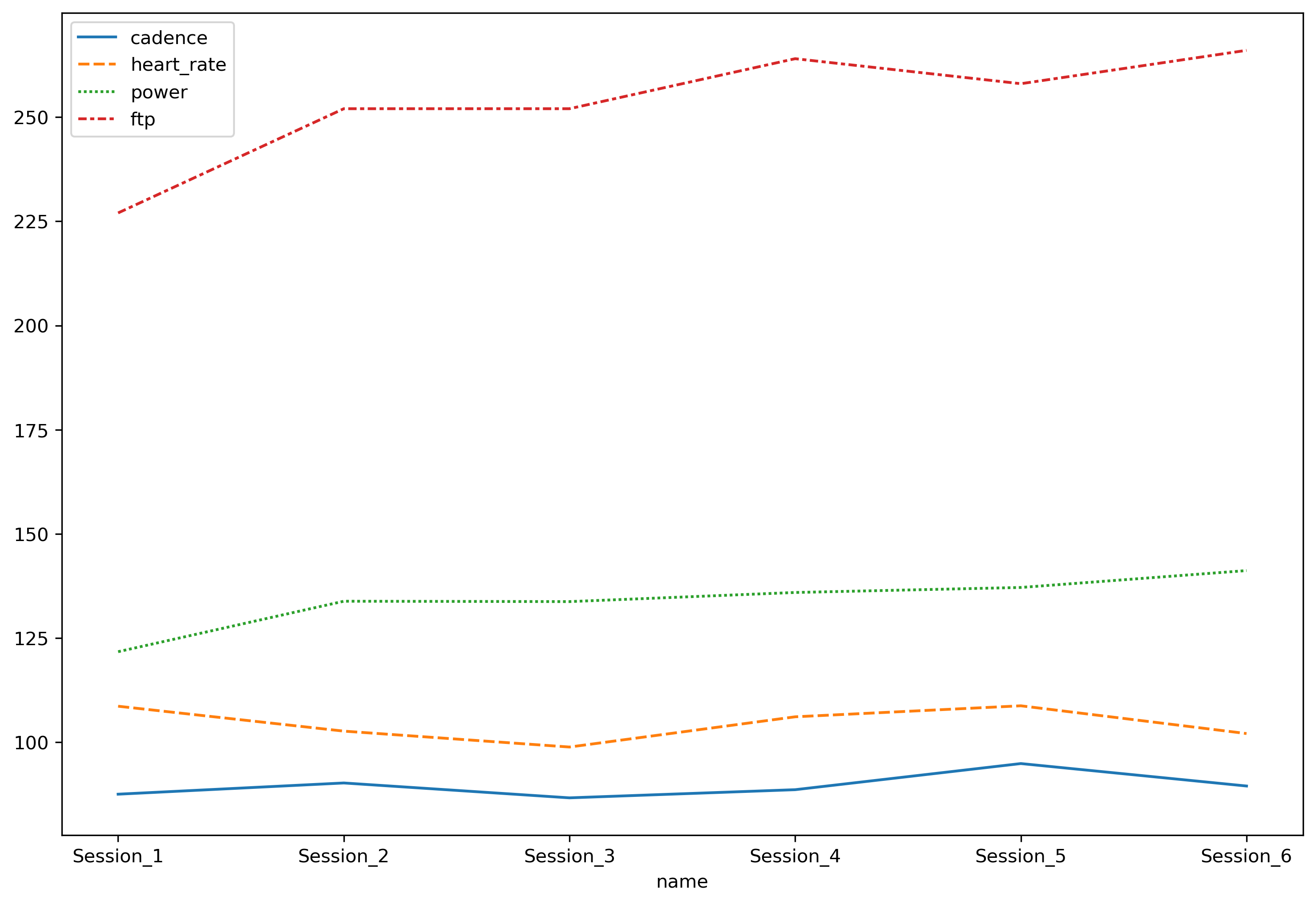
I was pleased with this visualisation, you can clearly see Average Power increasing relative to FTP, while Average Heart Rate drops. That’s what improving fitness looks like: higher intensity, less effort. I also like its imperfections, for example time isn’t relative here, the chart implies I completed the workout at regular intervals but sessions were spread unevenly over a twenty month period. This is good data to play around with and visualise in different ways.
Files
To follow along with this project, the following files are available for download: