Noodle 3 - Continued EDA in Tableau
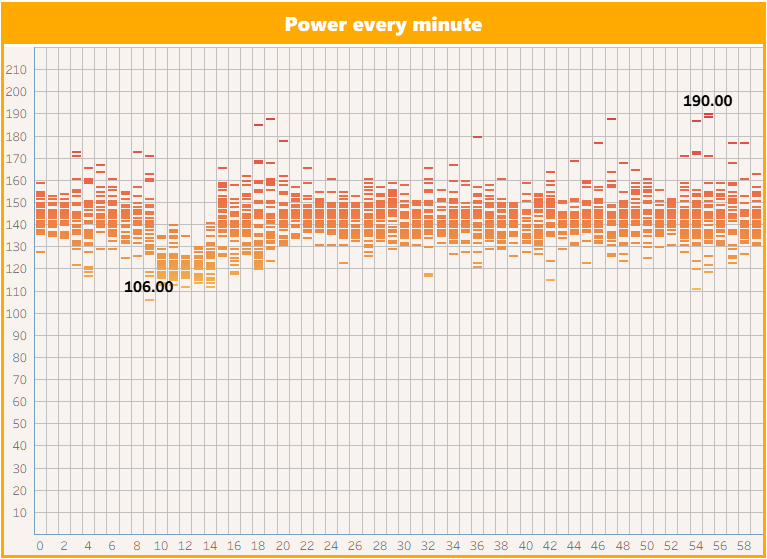
I imported the consolidated .csv file as a data source in Tableau. I experimented with different ways of visualising the data and eventually landed on a Circles chart with the distribution of power output during each elapsed minute of each workout. This visualisation revealed a pattern that I thought was worthy of analysis. First of all, the ability to view the distribution of power in each minute of a work out would be of particular value to cyclists in training, especially time-triallists. Additionally, what I at first thought was an interesting pattern in the data, that was repeated at various points within all of the files analysed, turned out later on to be nothing to do with my cycling performance and everything to do with my development as a data analyst!
Files
Tableau workbook coming soon!