Revised Dashboard
Taking on board the feedback I received from my Course Facilitator, I focused on the suggested improvements to my Tableau dashboard. The learning curve has been steep—getting to grips with the idiosyncrasies of Tableau has challenged me more than expected. My goal is to keep chipping away at improving my skills with this application until I feel confident creating visualisations that are both aesthetically clear and tailored to what stakeholders need to understand business problems and solve them effectively.
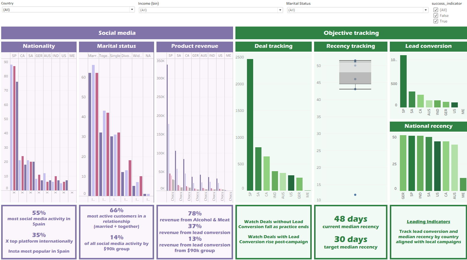
Summary of changes- State key questions and framework earlier: open the presentation with the specific business questions you’ll answer and explicitly mention the problem-solving framework (do this before maps/visuals).
- Rethink the map: with few countries, consider a different chart type (bar or dot plot) and add relative metrics (per-capita or per-customer) alongside absolutes to account for volume differences.
- Show distributions first: present overall age and income distributions (counts/histograms) before correlation plots (age vs income) so viewers understand group sizes and where bins may be needed.
- Relate demographics more broadly: connect age/income correlations to other variables (education, etc.) and show customer counts per group to judge robustness of results
- Split or reorganize complex slides: consider splitting “ad vs product spend” into two slides for clarity, and avoid repeating the same chart four times—use one chart with a dimension selector/filter instead.
- Increase dashboard filters & reduce repetition: add purposeful filters that enable cross-variable exploration (product → see ads by demographic) instead of repeating near-identical plots.
- Improve chart choices & labelling: where volumes differ, show proportions or per-customer metrics; replace maps or stacked bars where they obscure comparisons; ensure all labels are legible.
Files
Dashboard V2