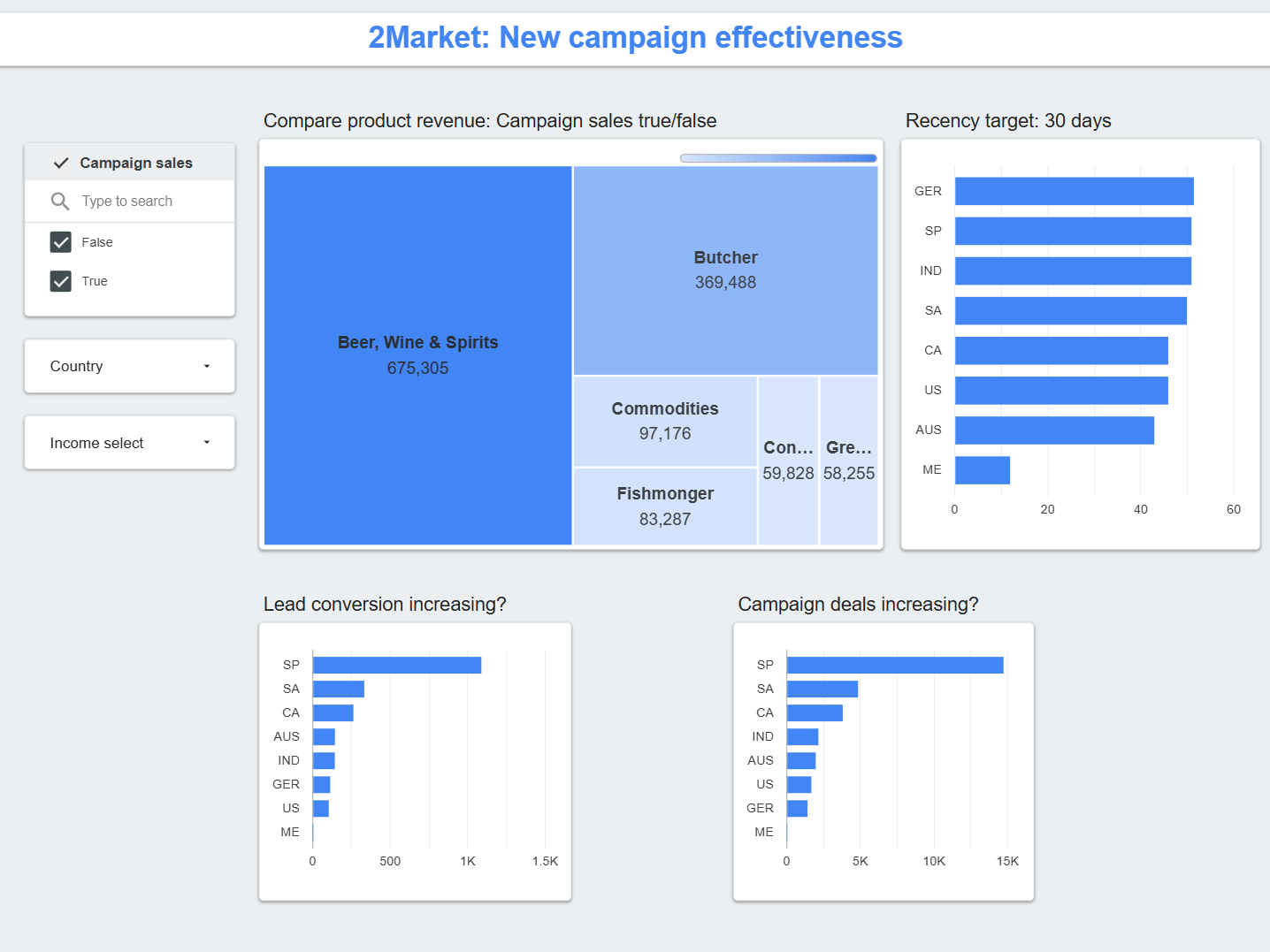
Taking Tableau further
My previous "Working Dashboard" in Tableau was less cluttered and easier on the eye, but it still felt constrained. In class, we were advised to avoid 'Floating' elements to simplify our first project by sticking strictly to the 'Tiled' layout. Good, practical advice for us as beginners, it was a limitation that locked out the more polished, layered designs I wanted to explore.
I decided to move beyond that initial guidance. With a focus on elevated design principles and richer interactivity, I set a new objective:
- Emphasise the Primary Goal: Direct all visual focus to 2Market's core objective: increased revenue.
- Clarify the Hierarchy: Arrange supporting levers and leading indicators so they inform without distracting from the main goal.
- Elevate the Aesthetic: Make it visually compelling through intentional colour palettes and strategic use of background imagery.
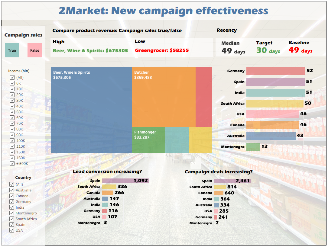
Learning Looker Studio
Recreating the dashboard in Looker Studio meant rebuilding it within a different, more rigid framework. The tool forced me to correctly and explicitly define dimensions and measures in a schema, rather than visually dragging fields. The main challenge was the treemap. Looker Studio lacks Tableau's "Measure Names/Values" feature to pivot data on the fly. The solution required reshaping the data before it reached the tool. I used Python's pd.melt() to unpivot the six product revenue columns into a long-format table of Product Type and Revenue. This new dataset became the single source of truth, enabling the treemap and ensuring all filters worked consistently. The Python notebook for this transformation is available for download.